In this Article
Creating the right impression matters when it comes to your business card. As an effective marketing tool, it should evoke apt feelings from your prospective clients and customers. It is in this aspect that you have to mind your business card design.
Aside from the colours combined on your card, you ought to put in the pertinent details about your company. You have to be aware of how to blend the appropriate elements of a good business card design.
It should be on the first meeting when you hand out your card. By all means, your potential patrons should feel the personal touch that goes with your pending business transaction.
Sending the right message across, people can then access your contact details and take action to visit your website and get in touch with you.
There are certain elements that you must incorporate on your professional cards for your business. The right information should be added in, while some details have to be left out. For instance, steer clear of congesting its contents, but on the other hand, give negative space. This is the space that you leave around your text and logo, highlighting them and letting your patron’s eyes breathe.
Be particular about designing a good and clean business card that conveys how organized and professional your company is.
What Information Should You Put On Your Business Card?
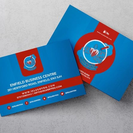
Your Company Logo Should Go On The Card
This aspect gives credibility and professionalism to your company. It indicates that you are a trustworthy organization. As a visual representation of your business, it signifies what you stand for. There are 3 common types of logos, and they are the following:
- Written Name: This is also known as a wordmark, and it is written as an embodiment of your brand. Examples of wordmarks are Visa and Google.
- Monogram or Letter Mark: In this type, the initial letters of your business are indicated, and they are arranged creatively. Typically, these are the abbreviations of long company names such as IBM for International Business Machines.
- Symbol: A pictorial is used to represent your company. Normally, a shape that relates to your area of expertise is utilised, or else an abstract symbol that embodies your brand. Examples of these are the apple symbol and the swoosh icon.
The Name Of Your Company

The fonts of this information should be the largest on your business card. It is what people remember most when they see it, so give ample space around it. It should be highly readable and prominent.
Your Brand Tagline
What products or services do you offer? Make a summary of it in six words or less. For instance, “Designs That Bring In Deals” signifies that your company makes business card designs that are sure to bring sales in. See to it that your tagline is honest, catchy and professional. Most of all, it ought to be relevant.
Your Name
This information should have a prominent space on your business card. People must remember you and you should personally reach out to them.
Your Job Title
If your recipients cannot remember your name, they are likely to come looking for you by indicating your designation or area of expertise.
The Logo On The Backside Of The Card
As a reinforcement of your brand, it makes sense to print your logo on the backside of your business card. Unlike the logo on the front which is printed with a colour gradient, the one which is on the backside should be in a single colour, such as black or white.
Your Website
When printing your website on your business card, skip the HTTP:// because it is not necessary. It takes up space as well. Be sure to have a website first before designing your card because this aspect should be consistent.
Your Contact Details
There are various ways of arranging your contact details on your business card, and that is either aligned left, right or centred. The preferred contact information like your email address or phone number should have larger fonts or be printed on a prominent part.
Do you have a brick-and-mortar location? If you do, indicate your address so that foot traffic to your shop or office will increase. Otherwise, you can leave this detail out if you work on-site or virtually.
Be sure to include your phone number and email address because these are the best means of contacting professionals nowadays.
Conclusion
These are the 8 things that you should put on your business card. Remember that less is more pertaining to the text content, and its design, overall, must be digestible. Put in as less information as you can, but make it vital. As for your fonts or typeface, limit them to 2 types and arrange them neatly.
It is tempting to work on your business card on your own, but it is smart to collaborate with a professional for the aptest, most credible and most attractive design.